CN#2. Best Practice Sign-Up Copy And Design To Maximise List Growth
To maximise free sign-ups, adopt these key design and copy writing tactics and features used by top newsletter publishers.
1. An attention-grabbing, benefit-driven headline
With attention spans counted in milliseconds, your headline may be your only shot at persuading someone to take action, so it has to work hard.
Strike a balance between short and pithy and squeezing in as many powerful benefits as possible.
Note: benefits NOT features.
Example 1: "Become smarter in just 5 minutes" (Morning Brew, 9 million subscribers)

The headline uses a desire-creating technique, promising something truly valuable (being smarter) in return for a small amount of time and effort (just 5 minutes).
The active voice (Become smarter...) urges action.
Example 2: "Get our free weekly Money Tips email!" (MoneySavingExpert, 7.5 million subscribers)
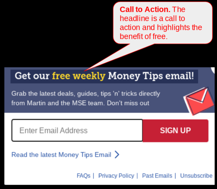
MoneySavingExpert keeps it simply and combines the benefit of free with a call to action (Get our...email!)
The headline is telling it straight. The exclamation mark adds enthusiasm.
The newsletter has been around for 20 years and the Money Tips brand is used to leverage existing awareness.
Example 3: Your Impartial, Comprehensive Daily News Source (1440 Daily Digest, 1.5 million subscribers)

1440 highlights neutrality, feeding off a backlash against partisan reporting, and promising to cover all news viewpoints.
The benefits of wide-ranging (Comprehensive) and regular (Daily), mean the headline highlights a fulsome, independent package.
2. A 1 or 2 sentence strapline with more benefits
The strapline, or sub-paragraph, is the second shot you have to persuade the visitor to take action.
Having grabbed attention with the headline, there's time for a longer sentence.
Drive home further detailed benefits and persuasively sell the proposition.
Example 1: "Get the daily email that makes reading the news enjoyable. Stay informed and entertained, for free" (Morning Brew)

Morning Brew fires in 4 more benefits, making 6 in total.
In as short a time as possible, the copywriter is making it hard for the reader to avoid signing up because the benefits are so great.
Example 2: "Grab the latest deals, guides, tip 'n' tricks directly from Martin and the MSE team" (MoneySavingExpert)

It's active (Grab...) up to the minute (latest...), and who doesn't love the benefit of free guides, tips and tricks.
MoneySavingExpert uses founder Martin Lewis's personal brand. He is a TV personality and money expert so his first name is enough (directly from Martin...).
Example 3: "We scour 100 sources so you don't have to. Culture, science, sports, politics, business, and more - all in a 5 minute read." (1440).
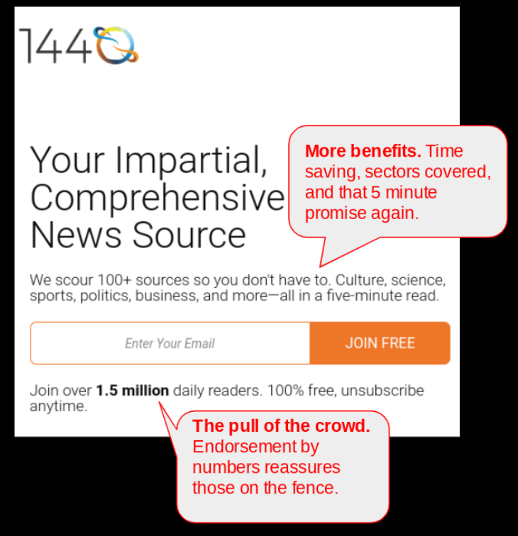
The biggest benefit of curation - its ability to save you time - is 1440's main strapline point.
No one person could scour 100 websites every day, so the promise that they do it for you is powerful.
There's a good sense of the sectors covered - and again, you get all this in just 5 minutes a day.
For fence-sitters, some reassuring facts are squeezed in under the sign-up box.
3. A clear call to action
The call to action should be an active instruction, led by a verb. Best practice is for the tone to be between gently forceful and insistent.
Examples:
Try It (Morning Brew)
This phrasing could make it easier to proceed by presenting it as just a trial - there's less commitment required.
SIGN UP (MoneySavingExpert)
Straighforward instructions from a no nonsense website.
JOIN FREE (1440)
Free is a top motivator, so this is a proven approach if offering a free newsletter.
Alternatively, you could try:
Get It Now (firm urgency)
Go For It! (aspirational)
Click Here - It’s Free! (nothing to lose)
Testing proves that some can perform better than others.
Unfortunately, research hasn't come up with a single right answer as responses vary between audiences.
4. Make email capture easy
Seems obvious, but you’d be surprised how many websites still get this wrong.
With an annoying cramped space that doesn't display the full email you can’t see if your email has been typed correctly.
Doubt or delay risks people giving up.
Note also the level of hand-holding for the visitor in these examples.
All three have a grey sample email address or instruction in the box to ensure people know exactly where and what to type.

Morning Brew's call to action

MoneySavingExpert's call to action

1440's call to action
Every base is covered to reduce uncertainty and increase conversion.
5. Optional extras
Other efforts you could make to get more sign-ups.
- Give visitors multiple opportunities. There are places to sign-up all over the Morning Brew website, increasing chances that one will catch the eye and prompt action.
They are: menu option, button in the menu, sign-up boxes at the top, middle and bottom of blog posts, and a pop-up box that appears after a set time. (closeable and does not appear twice).


- Offer a free report, checklist or industry guide as a “lead magnet”. This is a free gift incentive to subscribe.
This could be featured as one of the headline or strapline benefits, but don't overpromote the giveaway.
That's a recipe for people signing up just for the freebie and not really interested in the newsletter.
- Add a testimonial from a happy subscriber, with their picture.

The newsletter sign-up for Axios Charlotte
6. Multiple newsletter sign-ups
Big brand publishers have so many newsletters they can’t easily use the approach above.
What should they do?
They have to sacrifice some detail to offer all the options.
The Daily Beast says as much as it can for each title in this modular sign-up page.
The publisher gets 10 chances to get my email address, although the prospect of subscribing them all is daunting.
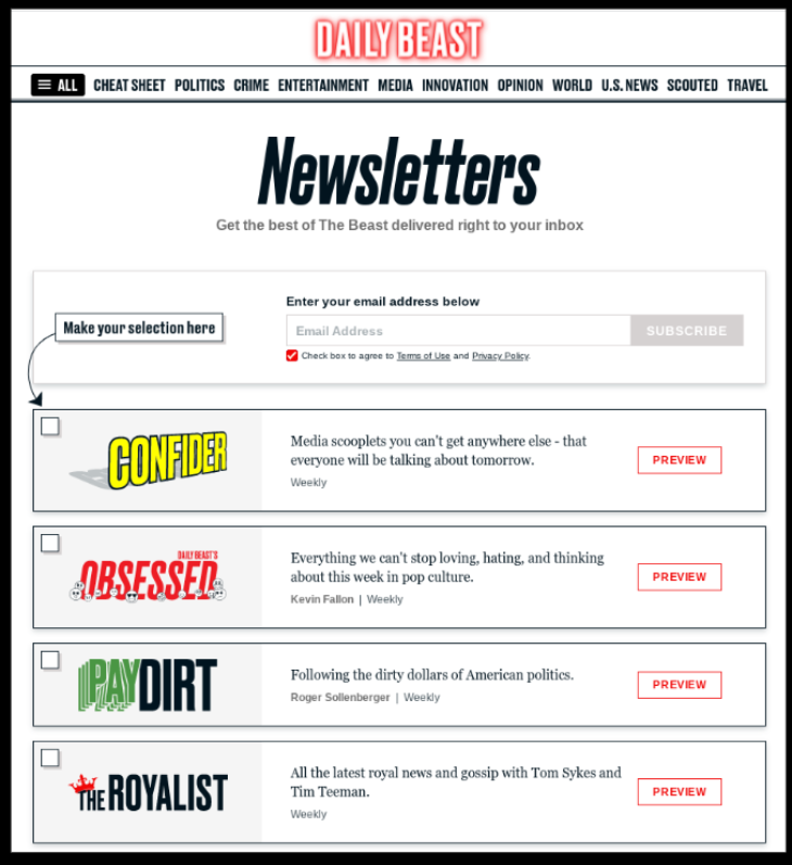
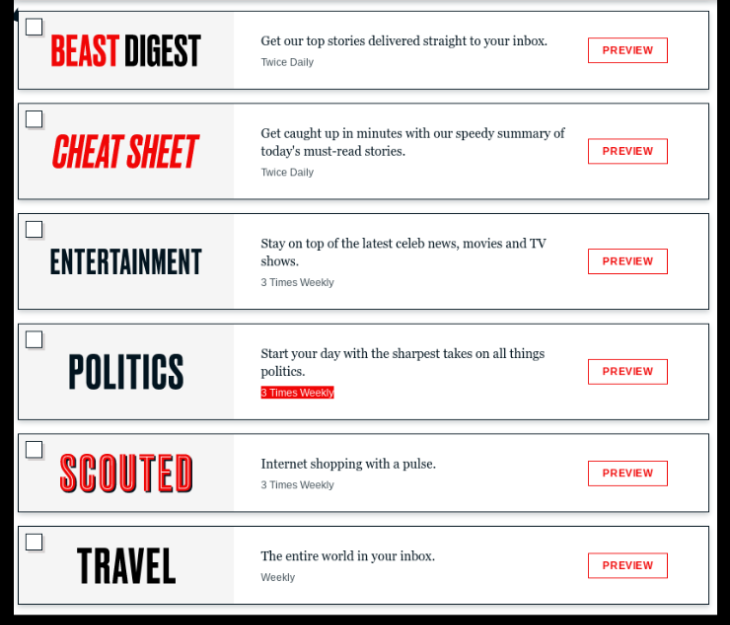
The Daily Beast offers 10 free newsletters
What returns to expect
The average lead generation landing page conversion rate is 4% according to Unbounce, an agency that analysed 74m sign-up page visitors from 10 industries.
But that figure can vary massively according to different audiences, their level of interest and engagement, and the effectiveness of the sign-up copy and graphics. There'll be more on the quality of traffic in future issues.
By targeting a specialised audience, offering real value, and directly meeting user needs, my experience is conversion can hit 30%.
Maintain high conversion rates by constantly driving fresh, quality traffic to your sign-up collateral.
Conclusions
- Some good free newsletters limit audience growth by not working hard enough on their sign-up procedures. By limiting this growth they are limiting growth of their paid subscription offering.
On their websites, they rely on prospective readers finding the place to sign-up, rather than making it easy to be found.
- Many newspaper and magazine sites ignore the potential of capturing email addressses in favour of presenting “hard” paywall options.
If they don’t convert to paid subscribers immediately, these visitors may never return, so a balance between payment and newsletter sign-up options should be considered.
- Persuasive, benefit-driven copy, highlighting good reasons to sign-up, always beats bland feature-driven copy.
- Don’t obsess over the graphics, or visual appeal.
The words used for the call to action, and even the colour of the button, can make a difference to conversion, but don’t agonise over them.
Summary
- Work hardest on the headline - it may be the only chance you get.
- Emphasise benefits not features
- Use a strapline to drive home more benefits
- Keep it simple to reduce friction
- Always help the visitor
- Leverage personal brands
Thanks for reading. I hope you enjoyed this issue and learned something of value. I'd love it if you'd consider sharing Champion Newsletters with friends and colleagues working in newsletters, publishing or content creation. They can sign up here.